The timeline
The core product surface: every event in chronological order, so the cause of a metric move is already on the page.
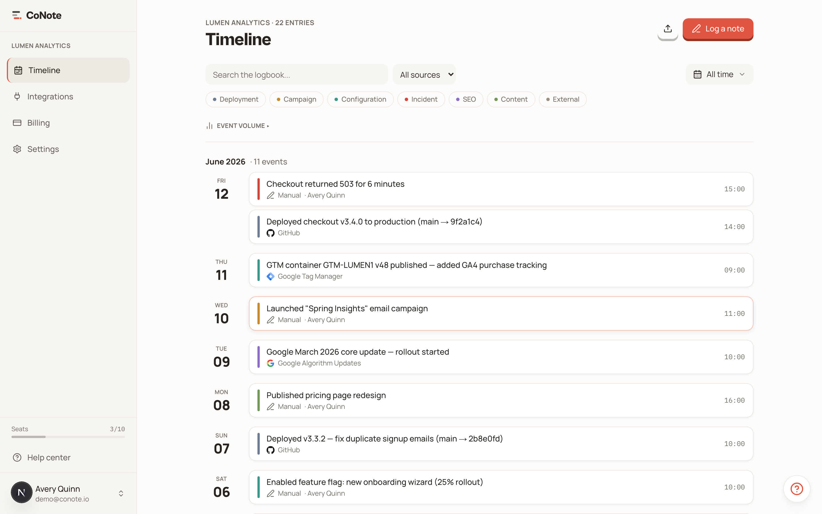
The timeline is the heart of CoNote. It shows every note in chronological order, grouped by day with sticky month headers, so scanning a period feels like reading a diary of your operations.
Reading the timeline
Each note is a card with a colored bar on the left showing its category — Deployment, Campaign, Incident, and so on — plus its title, date, and source. The colors let you scan a busy week and spot, say, an incident sitting right after a deploy.

Click any note to open its detail drawer, where you'll find the full description, tags, and a link back to the source event when one exists.
Correlation is the point
The reason events from different tools share one timeline is so you can see them together. When a number moves, you don't ask around — you jump to that date and read across the sources. The deploy, the paused campaign, and the tag change are all right there.
Moving around fast
The timeline is built for keyboard-speed navigation:
- n — log a new note
- / — focus search
- j / k — move between notes
- t — jump to today
- ⌘ K — open the command palette
Filters, density, and saved views live on the timeline too — see filters and views to make the timeline show exactly what you care about.